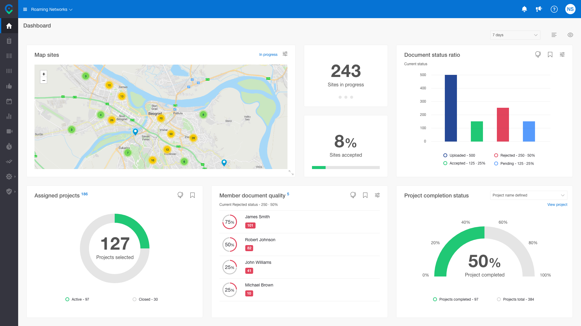
The dashboard display gives you the possibility for complete real-time insight into the situation by projects. It can help you make adequate decisions to react preventively to follow projects' planned, expected results.
You can easily adjust the appearance of the dashboard report, i.e., to personalize it in the way that suits you best for efficient and comfortable work in monitoring the quality of work performed through the CloseOut solution.
- Click on the eye icon on the Dashboard screen,
- Select the widgets you want in the dashboard
- Move them around and arrange them by simple drag and drop.
- Adjust filters on individual windows by country, tag, or project.

Depending on the assigned role, the user is shown some of the predefined data sets:
- Live tracking - displays the map of where the scheduled sites are located and where the Fieldworkers (scheduled green, not scheduled yellow circle) are using the Time Tracking currently. By clicking on the user circle or the site pin, you can see the details. The site pin changes color from blue to red if the users were in the site perimeter (100m) for more than 60 minutes and didn't upload documents (H&S).
- Sites map - displays the map of where your sites are located, filtered by project and status (active or closed). The pin is changing color depending on the number of cities in the area.
- Document status ratio - displayed as a percentage of accepted/rejected/pending documents in comparison to the number of uploaded documents. This is calculated for the active project(s) for specific users with appropriate roles (PM, Owner, Supervisor).
- Percentage of rejected documents - displayed as a percentage of rejected documents in comparison to the number of uploaded documents. This is calculated for the active project(s) for specific users with appropriate roles (PM, Owner, Supervisor).
- Percentage of accepted documents - displayed as a percentage of accepted documents in comparison to the number of uploaded documents. This is calculated for the active project(s) for specific users with appropriate roles (PM, Owner, Supervisor).
- Percentage of pending documents - displayed as a percentage of pending documents in comparison to the number of uploaded documents. This is calculated for the active project(s) for specific users with appropriate roles (PM, Owner, Supervisor).
- Member document quality - list of the top five members with the highest percentage of rejected documents.
- Validator document response time - list of validators that have the highest percentage of processed documents outside the 1h period since uploading.
- Health and safety certificates expiration - list of members whose certificates are about to expire in less than 30 days (yellow), less than 21 days (orange), and in 5 days or less (red). It can be filtered by certificate.
- Today's scheduled clocked in users - Percentage of the scheduled Users that are clocked in.
- Sites for closure - list of sites that are completed and ready for closure.
- Sites in progress - the number of sites that are currently in progress.
- Sites accepted - displays as a percentage of accepted sites.
- Completion status - percentage of completion for selected project;
- Percentage of closed sites or sites ready for closure - displays the percentage of closed sites or sites ready for closure from selected projects;
- Scheduled to work on-site with faulty certificates - displays the chart or the list of schedules on sites with faulty certificates in the next two days;
- Sites expiration - Sites that are expiring in the next 30 days.
- Milestones overdue - List of late milestones
-
Assigned projects - Assigned projects for user
Dashboard reports constantly evolve, and new dashboard reports will be available in future software versions.